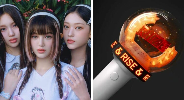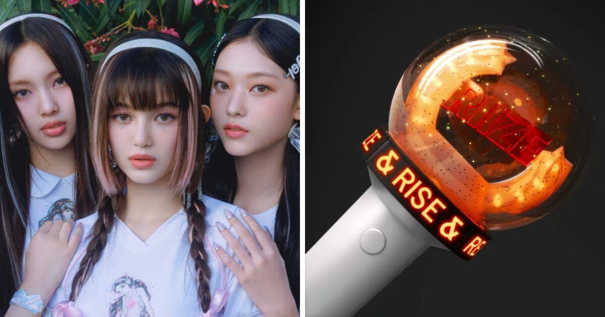
“Bunnies” noticed a striking similarity between their lightstick and that of RIIZE.
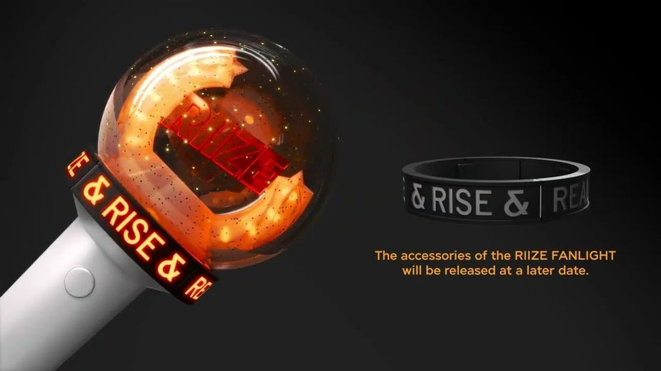
Everyone knows the importance of lightsticks in the K-Pop scene — they’re the tools fans use to show their love and support to their favorite groups. This significant meaning has caused controversy regarding fans of NewJeans and the newly redesigned lightstick for another K-Pop group, RIIZE.
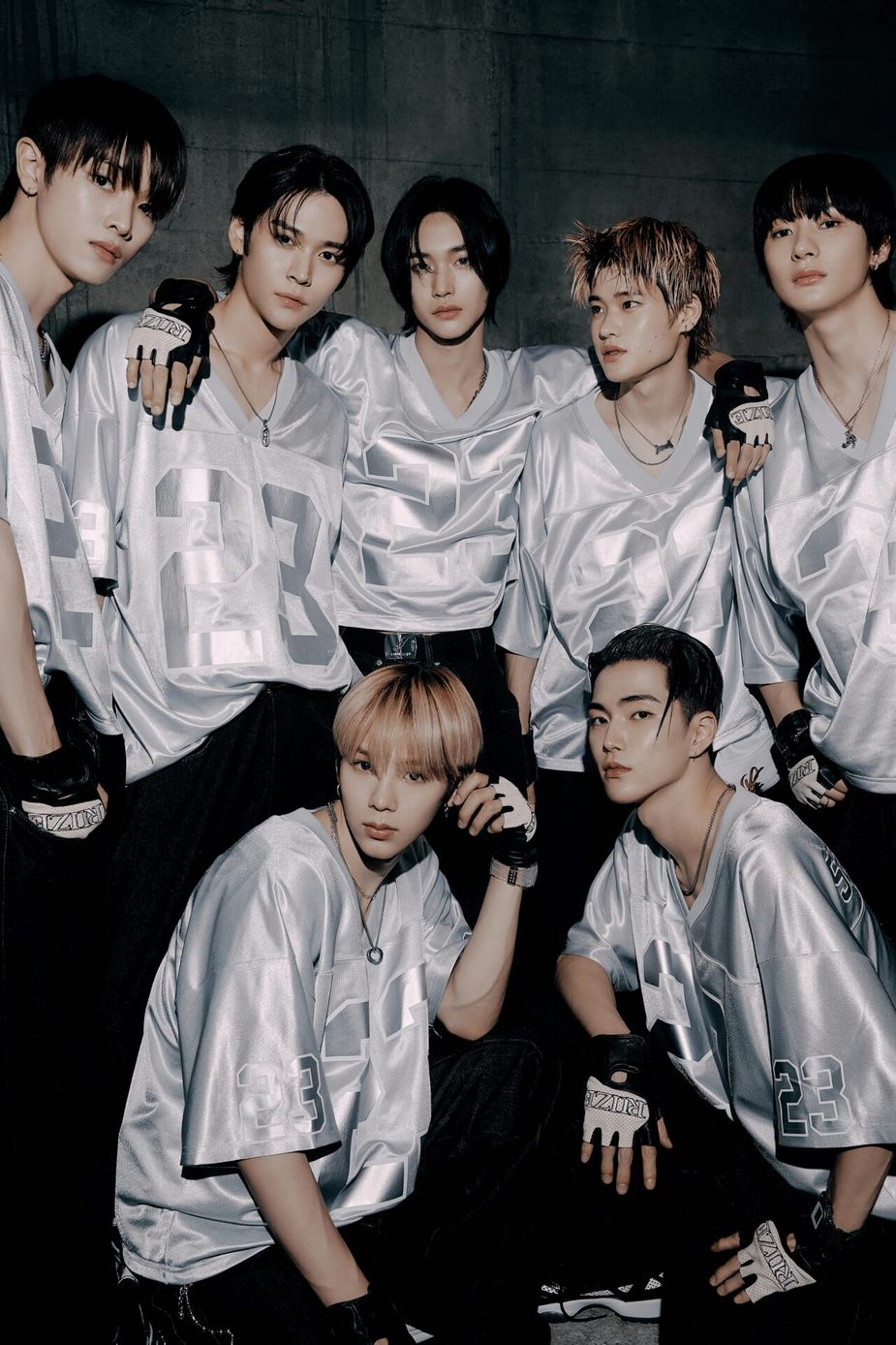
The issue surfaced when NewJeans supporters noticed a striking similarity between their lightstick and that of RIIZE in a specific setting: the darkness of a concert venue.
While both lightsticks boast distinct designs in the light, they share a common feature when the lights go out — both items illuminate to form heart shapes. NewJeans’ lightstick glows with blue hearts, while RIIZE’s emits dark orange ones.
ㅋ…………………….. https://t.co/L2hhkuT2xg pic.twitter.com/HHy6JKvEkX
— 😏 (@newsuhanmoo) May 5, 2024
라이즈 응원봉 보고 다같이
칵테일 새우인지 분모잔지.. 하고잇엇는데
멀리서 보면 하트처럼 보인대 히발 ㅜㅜㅜ pic.twitter.com/vwnwtnHTtN— 그게.. (@dedibinn) May 4, 2024
After seeing RIIZE’s lightstick, everyone was wondering if it looked like a cocktail shrimp or a pile of rubbish. But from a distance, it supposedly looks like a heart, how frustrating!
— dedibinn vis X (formerly known as Twitter)
The similarity has sparked outrage among NewJeans’ fans, who have accused RIIZE’s managing company, SM Entertainment, of copying this unique aspect of “Binky” — the name of the group’s lightstick.
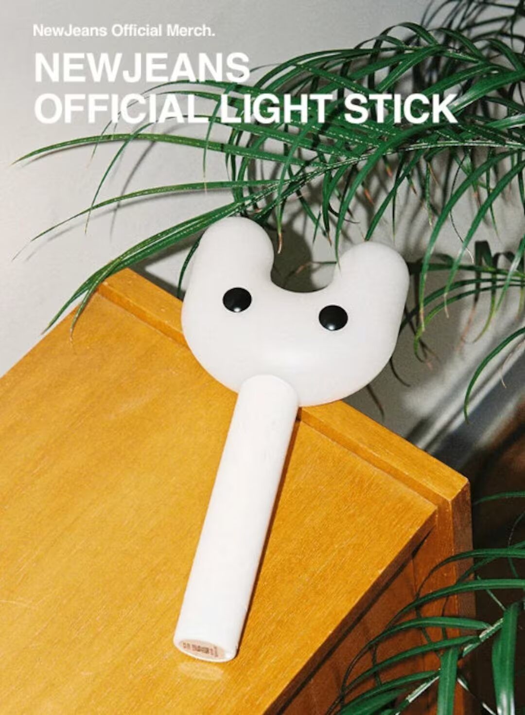
NewJeans fans have not held back in expressing their disappointment, labeling SM Entertainment as “shameless” and alleging that the company intentionally “stole” the heart-shaped glow feature from NewJeans and their management, ADOR.
https://t.co/NmS0Gqo0ik pic.twitter.com/o1eJi09m4g
— 🐰 (@renebxebxe) May 5, 2024
They are so obsessed with new jeans its giving shameless! F why can’t we have our own thing without anyone copying it? Tokki please send trucks, do protest or whatever, we cannot let this one slide https://t.co/hcNAC3vnXb
— Catochloecat🍀 (@Catocatocat123) May 5, 2024
shameless company. if they really want a boyjeans, why can’t they also copy the way ador treats newjeans? https://t.co/omny79LYUP
— revie 🪐 (@reviedreams) May 5, 2024
On the flip side, RIIZE’s fanbase has come to the defense of their lightstick’s design, emphasizing the differences that set the two apart under normal lighting conditions. They argue that the functional design in darkness — using heart shapes — should not be grounds for accusations of plagiarism, suggesting that such elements could be coincidental or generic.
lightsticks that look like hearts in NOT a mhj invention this is so dumb i can’t pic.twitter.com/yVAxyAEnfq
— ᯓ ❥ (@wonbinlvrs) May 5, 2024
nah qrts gotta be acting dense on purpose bc that’s clearly two different light sticks.. pic.twitter.com/QAPEyEBi3K https://t.co/ZQoZ4BTMcm
— 𝜗𝜚 (@Ieeyoee) May 5, 2024
Prior to this controversy, RIIZE’s lightstick had already undergone a redesign after its initial unveiling was met with criticism and mockery from fans and netizens alike. Originally intended to symbolize an upside-down “7,” the initial design did not sit well with the fans, leading to its swift retraction and a promise of a redesign, scheduled for release in April 2024.
this the main purpose of riize lightstick
— wiz (@jhyngae) March 5, 2024
As tensions simmer between both fan groups, it remains to be seen if either company will respond to the accusations and get involved in the debate.
