See Full Size
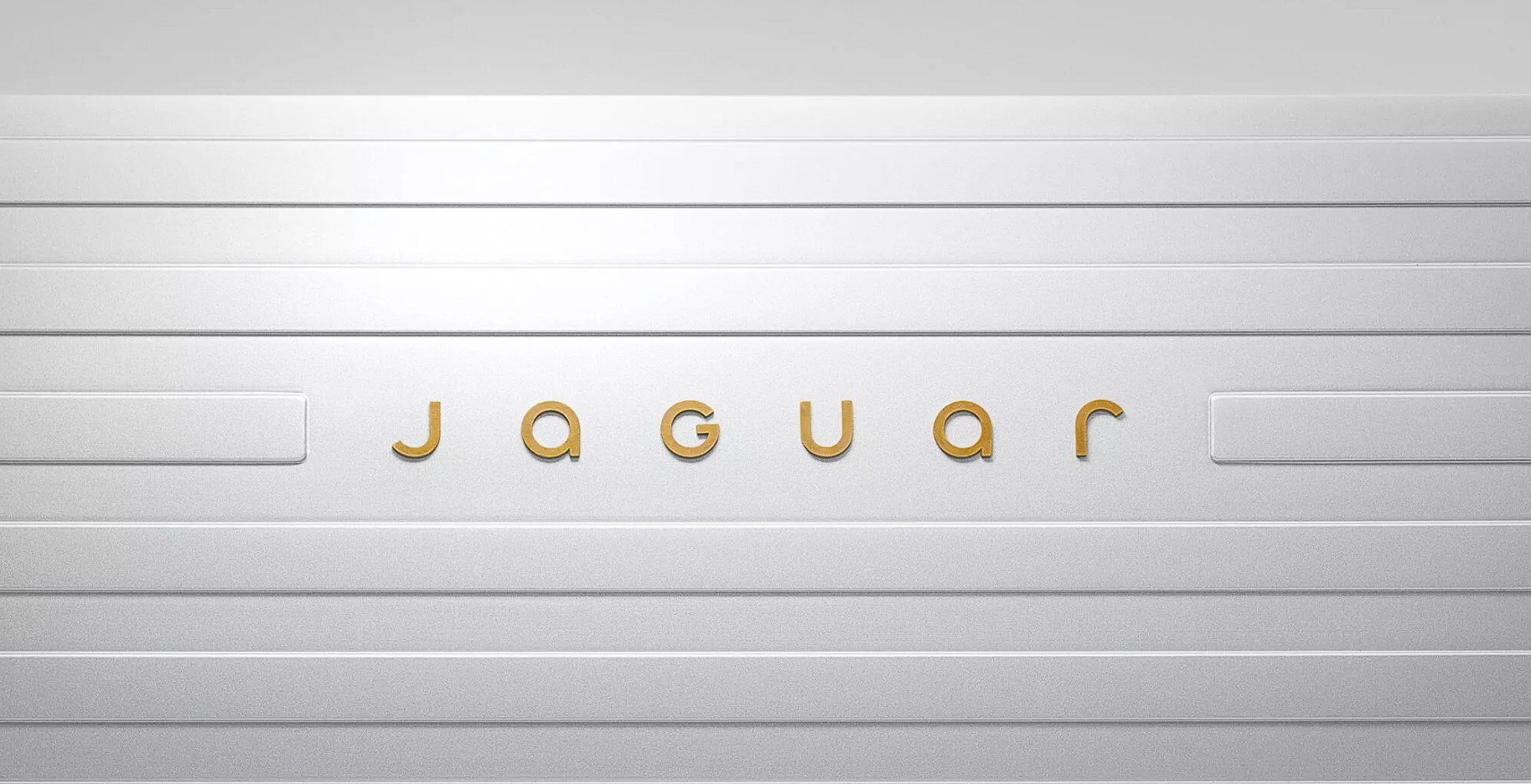
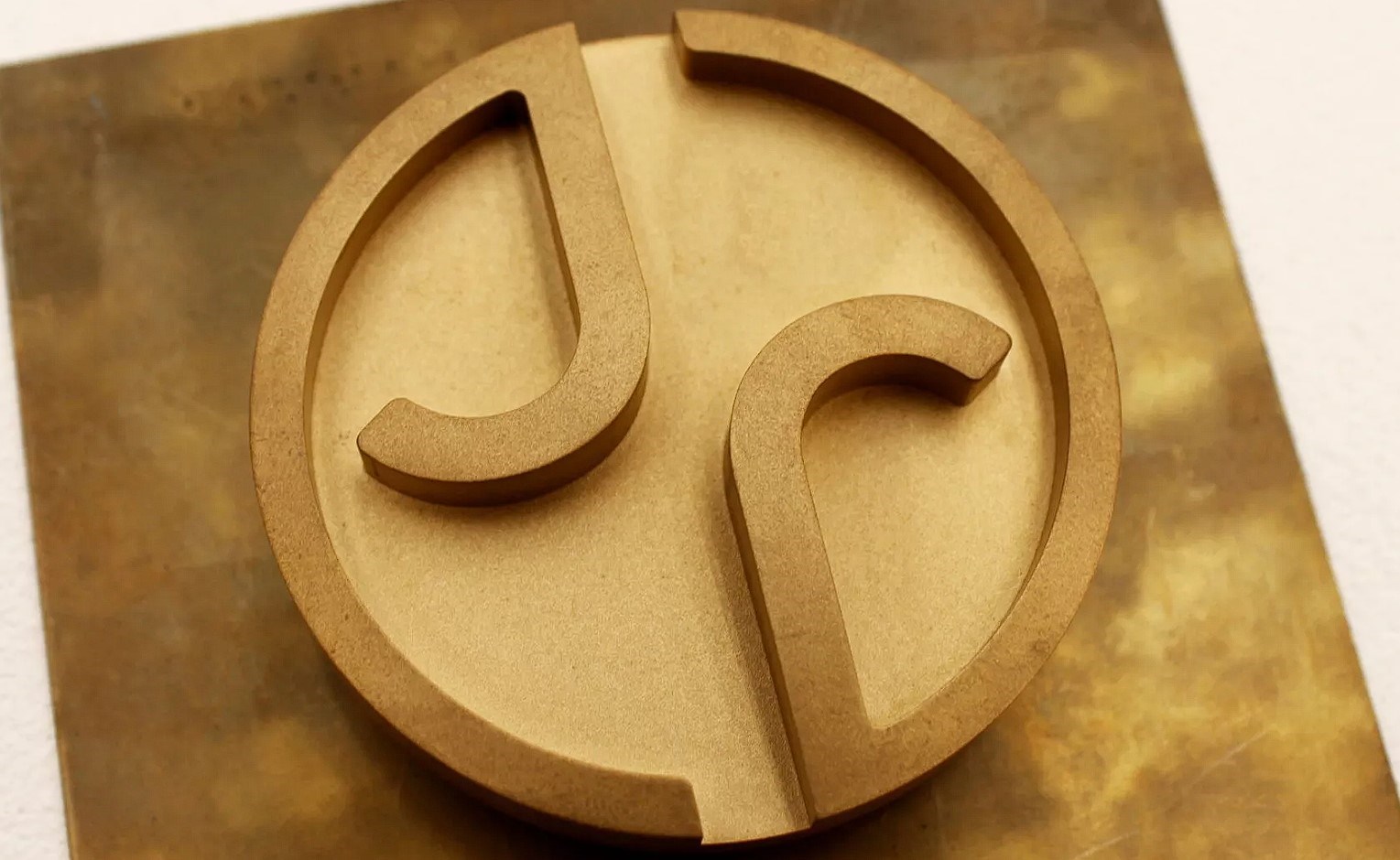
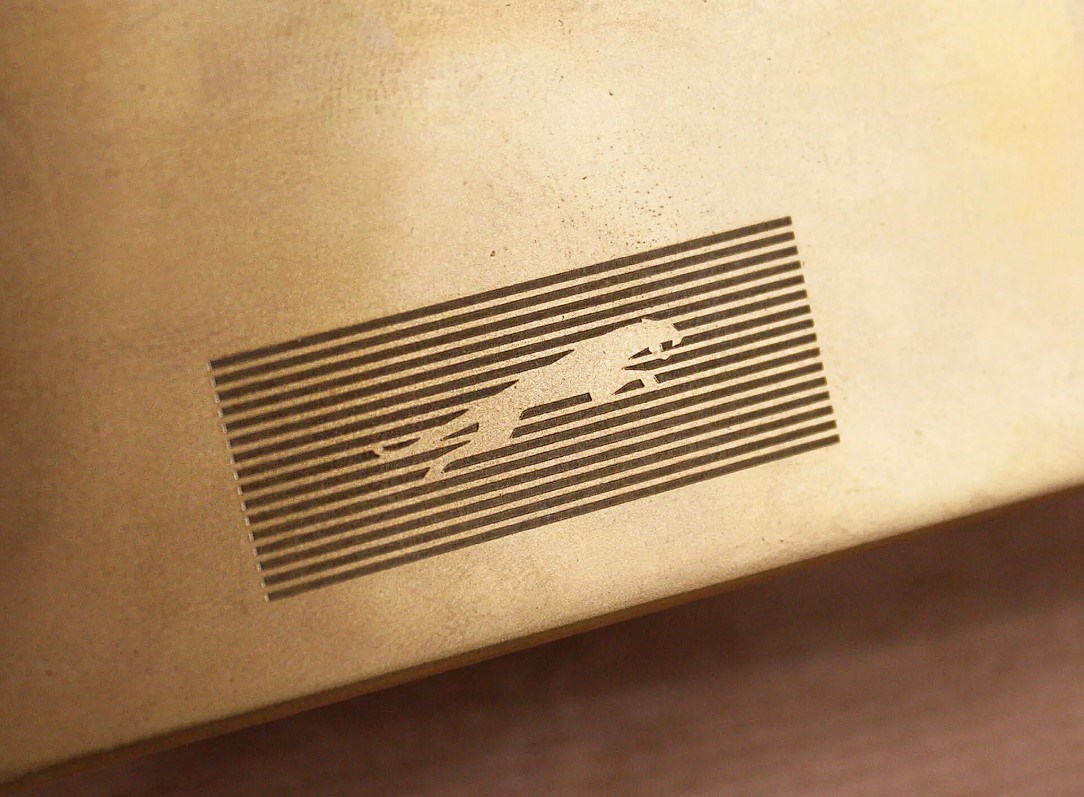
Jaguar’s new work consists of four main elements: Device Mark, Strike Through, Color Palette and Maker’s Mark. In the first of these, the phrase “Jaguar” appears in a new font called Exuberant, which is characterized in a simple and symmetrical way. Strike Through is a 16-strip graphic consisting of horizontal lines. This graphic will be used in the background of new models and will be a universal symbol for the brand’s new era.
See Full Size
10 million production in 30 years: Here are BYD models from past to present
Jaguar executives see the change as a “fearless move” and a “complete reset”. They state that with this change, they have re-created Jaguar for the future and have undertaken a job that returns it to its once beloved values. What do you think of Jaguar’s new logo?
This news our mobile application Download using
You can read it whenever you want (even offline):


17 hours ago
1
This video really bored me
4 days ago
2
either add new video or remove this video
2 weeks ago
Ideal for short term use during 1 summer,
2 weeks ago
Activity
3 weeks ago
It looks like so much fun :))
1 month ago
It looks like a lot of fun 🙂
1 month ago
looks like fun
1 month ago
3
Perfect for Mars 🙂
1 month ago
An extremely different tool 😀
2 months ago
1
rubbish
2 months ago
Isn’t it sold in Turkey yet?
2 months ago
@ccguven became food for the Syrians who entered his house, their first job was not to eat…
2 months ago
Pyramid again (I emphasize the Masonic symbols I see all the time, let’s know the statistics, let’s not do business with the locals)
4 months ago
Even when the international price is 9k, people lose their enthusiasm.
4 months ago
I’ll buy one for my son.
8 months ago
If the legend came to Turkey, I would buy it..
8 months ago
3
Those lighting effects had to be on the top, not just on the sides. In this way, the person using the gun will have to tilt his head to the side and there will be no hernia.
9 months ago
It’s a perfect gun, I wonder how fast it fires. (picture) (picture)
10 months ago
If the price was reasonable, it would really be legendary.
10 months ago
Wow, this device came from Xiaomi and I was wondering who produced it..